The Lyrics Lettering 00015-You're Not The One by Chester See
Music LetteringThe Work
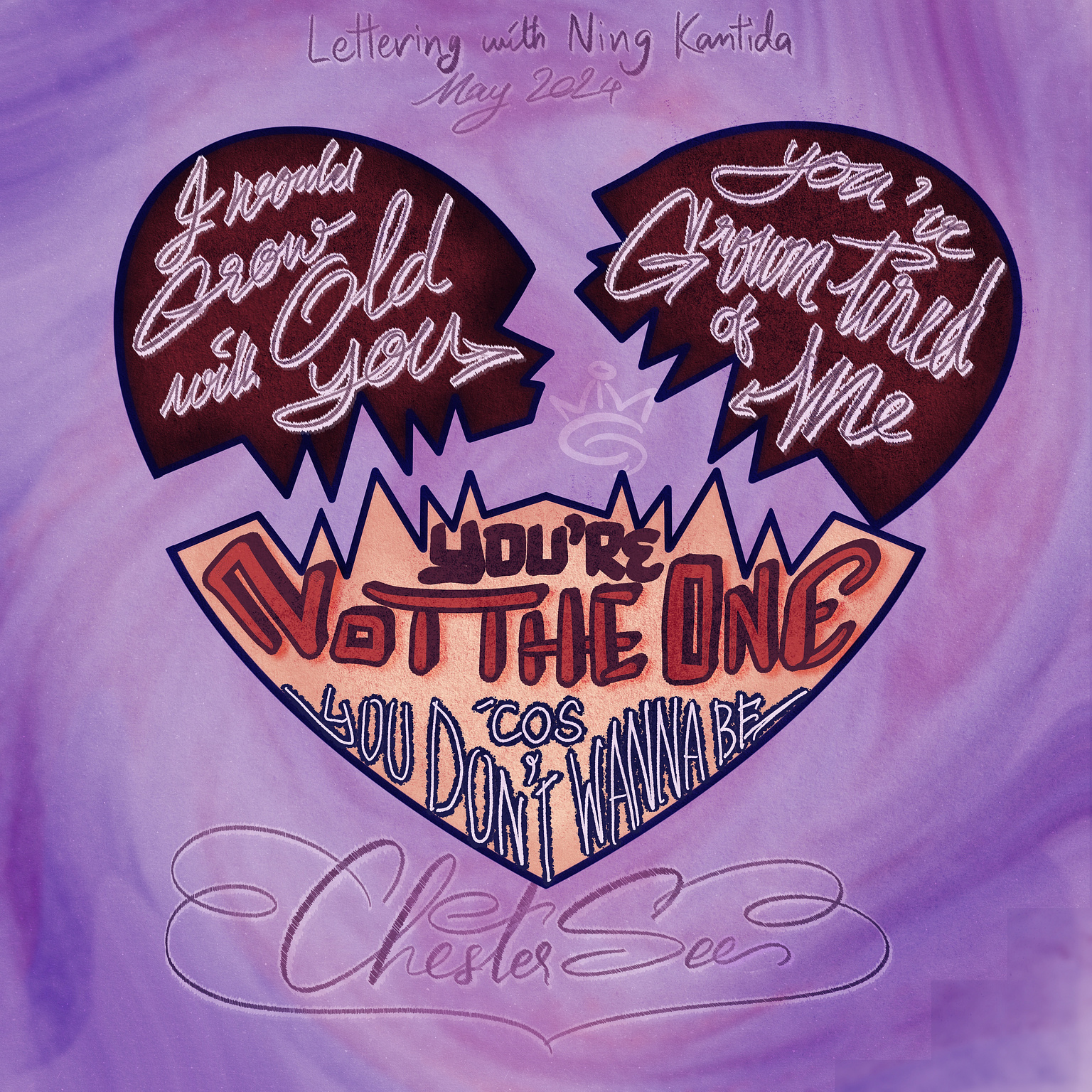
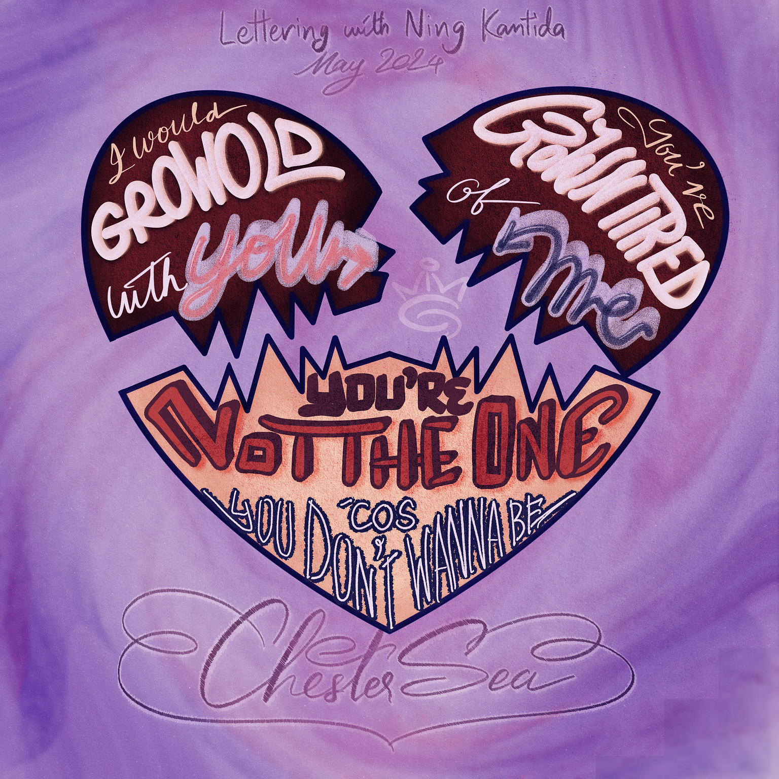
This is the lettering design inspired by the song "You're Not The
One"

The Inspiration
Chester See's music hits differently with those emotional vocals in his songs. "You're Not The One" had me in tears the first time I heard it, and it's still on my mind to this day. It's just such a heartbreaking song about letting go of someone who can't see you as their person, no matter how hard you try to make them see it.
You're not the one 'cause you don't wanna be
I might have chosen you but you chose differently
You might make me feel whole but I don't make you complete
I would grow old with you but you have grown tired of me
No, you're not the one 'cause you don't wanna be
The Process
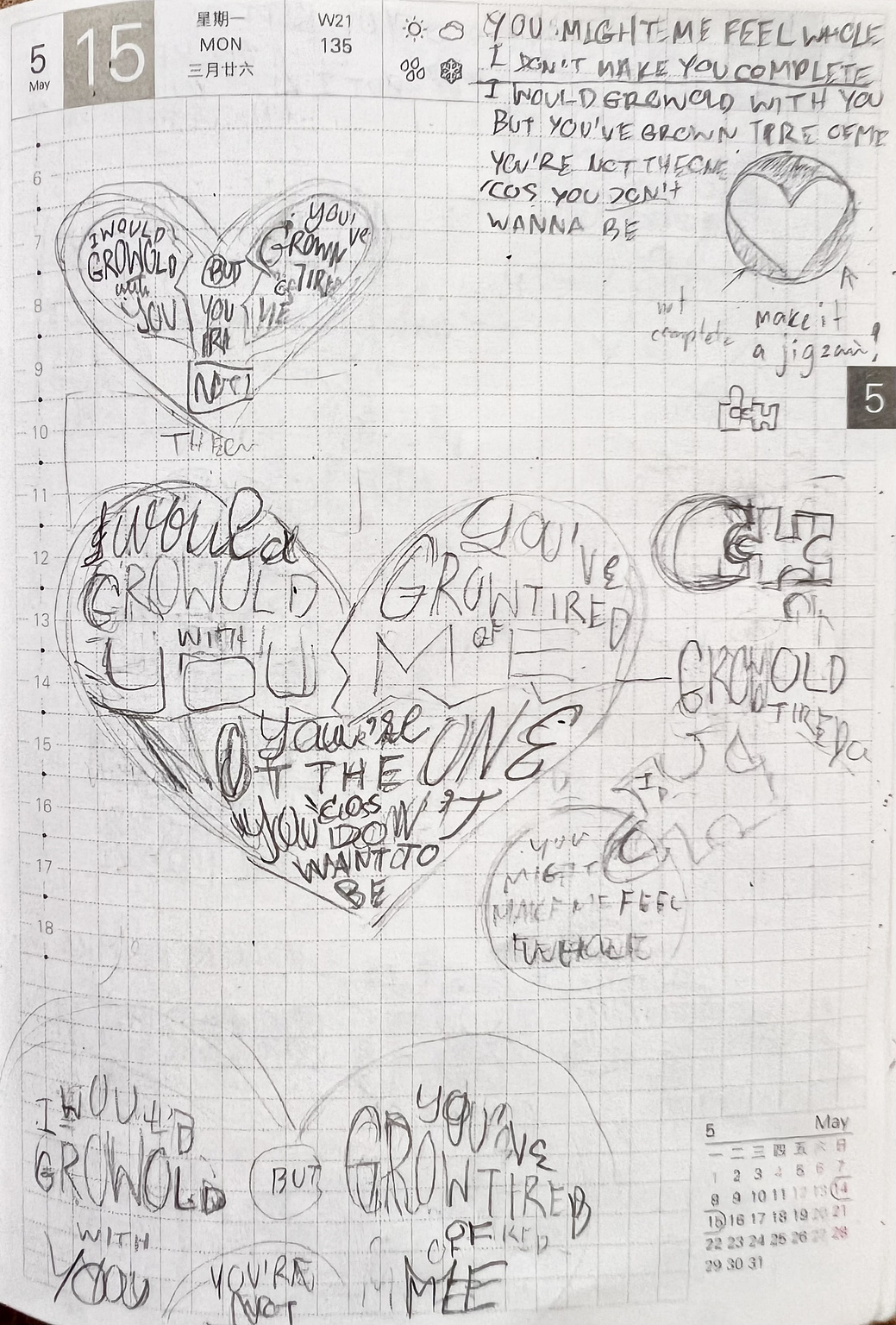
I originally thought of using jigsaw pieces to symbolize the whole "not fitting together" concept, but then I realized it might be too playful for the mood of the song. So, I went with a broken heart instead, with one piece drifting off. I thought it fit the vibe better.

However, after I jumped into the process, I focused too much on fitting the letters into a heart shape. In doing so, I lost sight of the true essence of the lyrics, resulting in a jumbled mess that failed to convey the intended message. It took me too long to realize and tried to use simple script letters, but I ran out of time for the day. I admit to overcomplicating the design and running out of time for improvements.

Lesson learned: keep it simple first, then add flair,
not the other way around. Always start with simplicity and build
upon it with creativity, rather than getting lost in complexity and
losing sight of the core concept.
While I may have fallen short in my visual representation of
"You're Not The One," I am eager to take on tomorrow's challenge.
Hopefully, I won't mess it up because I love the song choice🤞
