
The Logo Concept 01-Alison Cosmetics
The Logo Concepts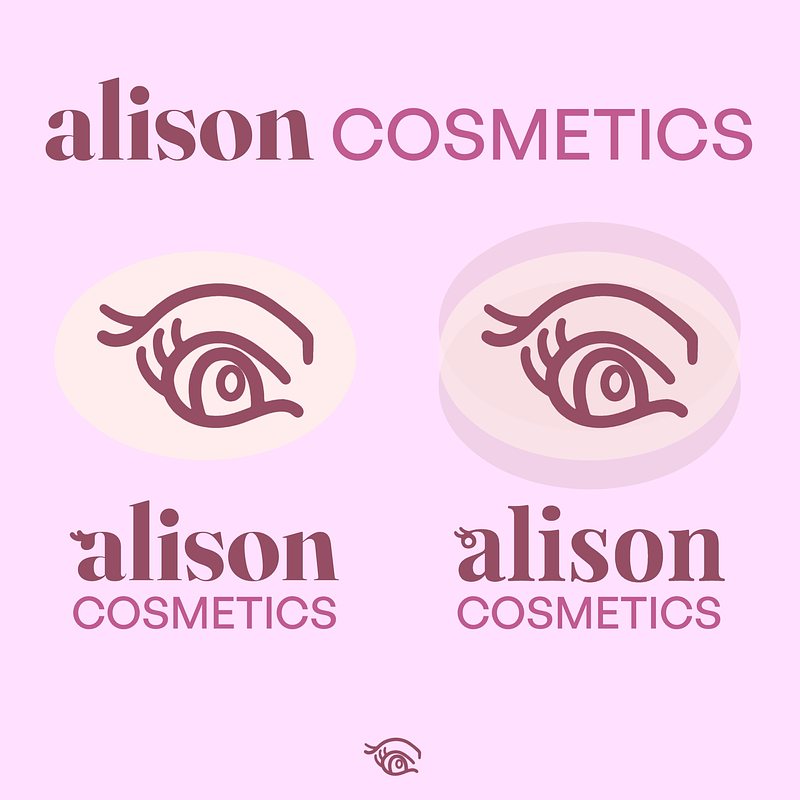
Logo Concept Series
I decided to expand my skills in icon mark and typography to broaden my design range, especially for logo design. While exploring this journey, I came across a daily logo challenge from Logo Core and decided to take it on. So, I will showcase the results of my logo practice based on the provided briefs.
Think of this post as a presentation of the initial concept to an imaginary client. It's my way of discussing my thought process and my design choices before exchanging feedback and revisions.
Please keep in mind that creating a polished logo design typically requires more than just a few days. Therefore, consider everything from this challenge as a draft that will need further feedback from clients for refinement to truly shine.
While these designs may not be fully refined, I believe they will offer us a general idea of the concept.
That being said, let's kick things off with the first brief from the challenge: Alison Cosmetics.
The Brief from LogoCore on Alison Cosmetics
Hello!
I'm the owner of Alison Cosmetics and I'm looking for a new logo for my online beauty store. I was recommended by friends that you were the perfect designer for my design project!
My previous logo was just a boring font, and it didn't really represent the products we are selling. It also didn't look very great when used as a profile picture on our company's social media. I was hoping you could make our store more memorable with an eye-catching logo!
We mostly sell skincare products and cosmetics that include lipsticks, eyeshadows, blushes, and eyeliner. All of the products are vegan, and we're well known for our product bundles where we sell several of our best-selling products in a curated package designed by a local artist.
The store mostly uses soft colors, ranging from pinks to purples, so I'd prefer to stick to similar tones in order for the store's visuals to feel unified. I'm also not interested in any cursive typefaces--I just don't think it would be legible on our website.
I am also interested in printing the new logo onto the bottom of our cosmetics in the future. The printing area would be around 2cm by 2cm on black surface. It would be amazing if the logo could fit into this tight space.
I'm excited to see what you come up with!
Alison Lee
CEO of Alison Cosmetics
Brief Interpretation
The client's brief emphasizes not using boring fonts, implying a desire for uniqueness and creativity. An eye-catching logo implies the desire to steering clear of typical industry norms. For the wordmark, the client specifically stated not to use cursive typefaces because they are concerned about legibility and the scalability of the brand mark for small packaging is also a concern.
Therefore, the logo must be unique, creative, eye-catching, legible, and scalable down to around 2 cm.
The brief specifies using tones of pink, purple, and soft colors, allowing the client to maintain their existing color palettes. This can simplify the client’s process, avoiding the need to learn new color palettes to associate with the brand, especially since they already used curated packaging designed by local artists, highlighting the creativity and uniqueness of the brand.
Since it’s primarily vegan skincare products, along with some cosmetics—lipsticks, eyeshadows, blushes, and eyeliners—we need to take all of these into consideration and design an icon mark that represents these aspects effectively.
It should emphasize creativity, legibility, environmental friendliness, and universality for various applications, especially on the packaging.
Conceptualizing
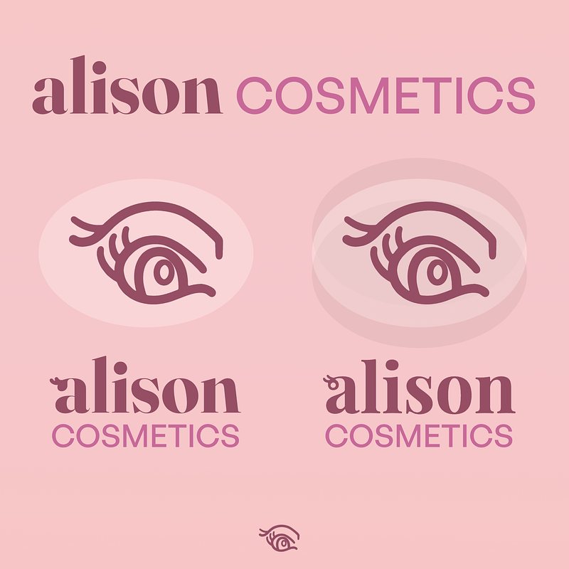
Having understood the brief, I began sketching ideas. Initially, I considered a monogram approach but realized it would appear bland, something the client mentioned to avoid. I then incorporated symbols representing their brand identity and products. I chose to focus on an eye as a central theme, subtly integrating an 'A' and 'C' into an eye shape, reflecting beauty and skincare.
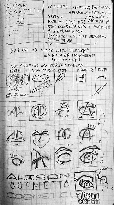
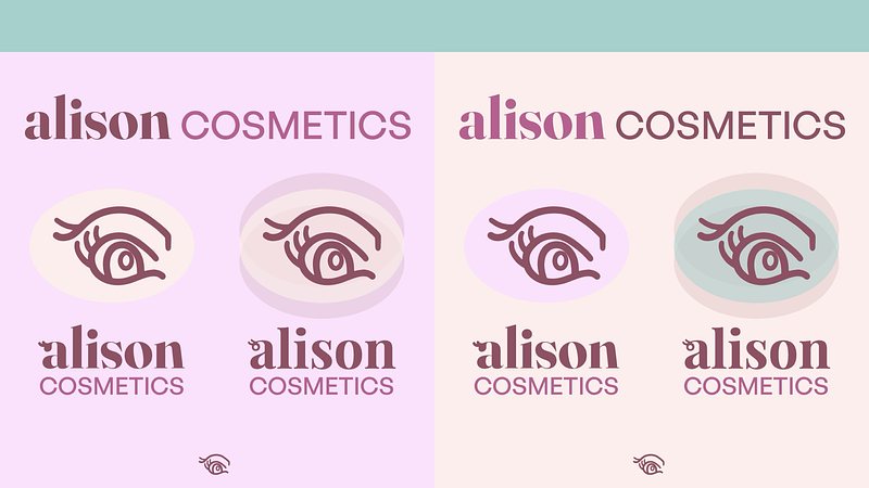
After numerous iterations, I settled on this eye icon for the icon mark. I believe it is eye-catching, distinctive, and possesses a certain elegance, yet remains approachable. It's captivating enough to prompt people to stop and take notice when they see the logo on packaging. The goal is for the logo to be captivating and universally applicable. This design is scalable, maintaining its eye shape and brand recognition even at a small scale.
Digitalization
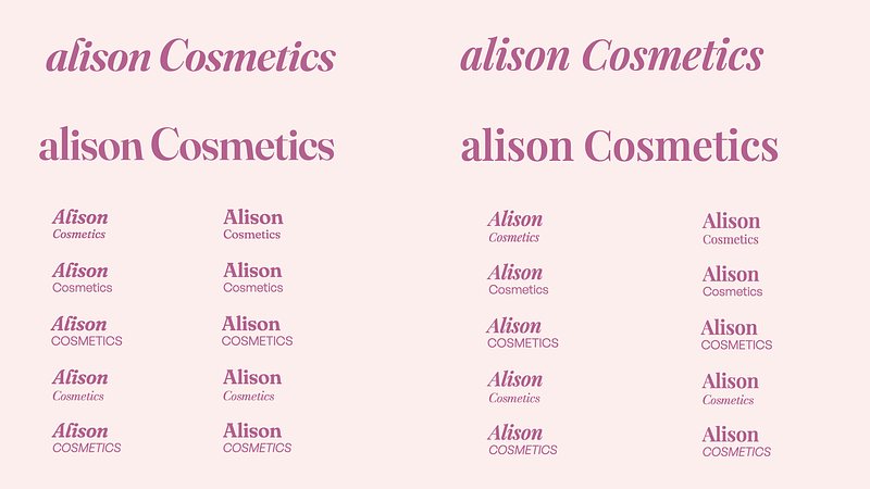
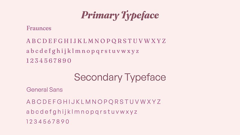
For the wordmark, I would offer two typeface choices: Playfair Display, which leans a bit more elegant, or Fraunces, which is more dynamic and creative. Both options look great and suit the brand; it depends on the client’s preference for elegance versus approachable. Personally, I would suggest using the Fraunces font because it appears eye-catching, playful, and helps connect with the audience and customers better.
To customize the wordmark, I chose to use lowercase letters for "Alison" because I wanted it to look more dynamic. I added a subtle eyelash element to the letter “a”, referencing the icon mark and enhancing the overall message that the brand aims to convey to the audience.
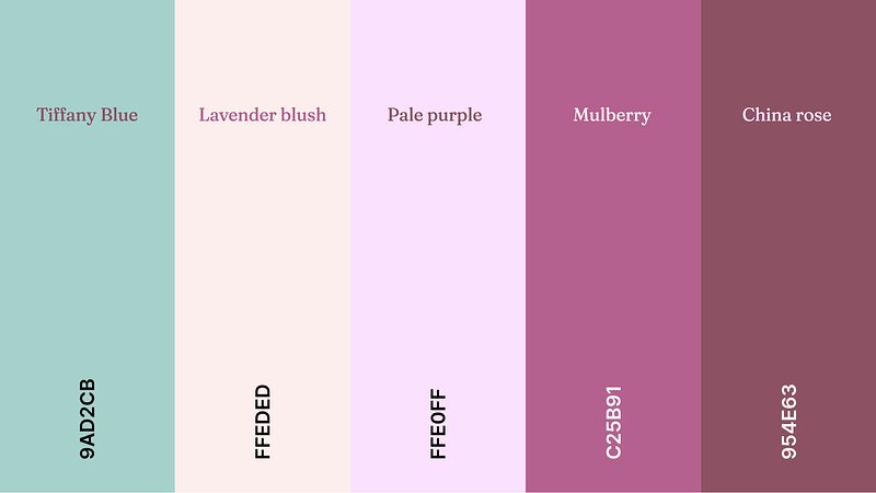
For the color, since the brand focused on skincare products, I incorporated the cream along with subtle pink and purple to represent the skintone and how Alison Cosmetic products can elevated the beauty.
Final Words
This is my logo concept for Alison Cosmetics, aiming to convey the brand identity by combining a distinctive eye icon that reflect its gentle, beauty products. The use of soft, harmonious colors like pinks and purples, which evoke a sense of gentleness, care, and femininity—qualities that resonate deeply with the target audience of skincare and cosmetics consumers. Its clean, legible typography and scalable design ensure consistent recognition across all platforms and packaging. This cohesive visual identity reinforces Alison Cosmetics’ commitment to natural, creative, and approachable beauty, making the brand memorable and trustworthy to its audience.
P.S. Given more time, I would have made the eye lash for the wordmark a bit more fluid, so it can be used as a submark.