The Log 00001-My first 12 Days of Lettering Sketches
The JourneyI have been daily lettering ever since April 19, which marks the beginning of my journey into the lettering world.
These are the daily sketches from April 19, the day I started lettering, to April 30. Each day presented its own challenges and triumphs, pushing me to think outside the box and experiment with different styles and concepts in lettering. From logo design to inspirational quotes, each piece has its own story to tell. And I'd like to take you through my process day by day.
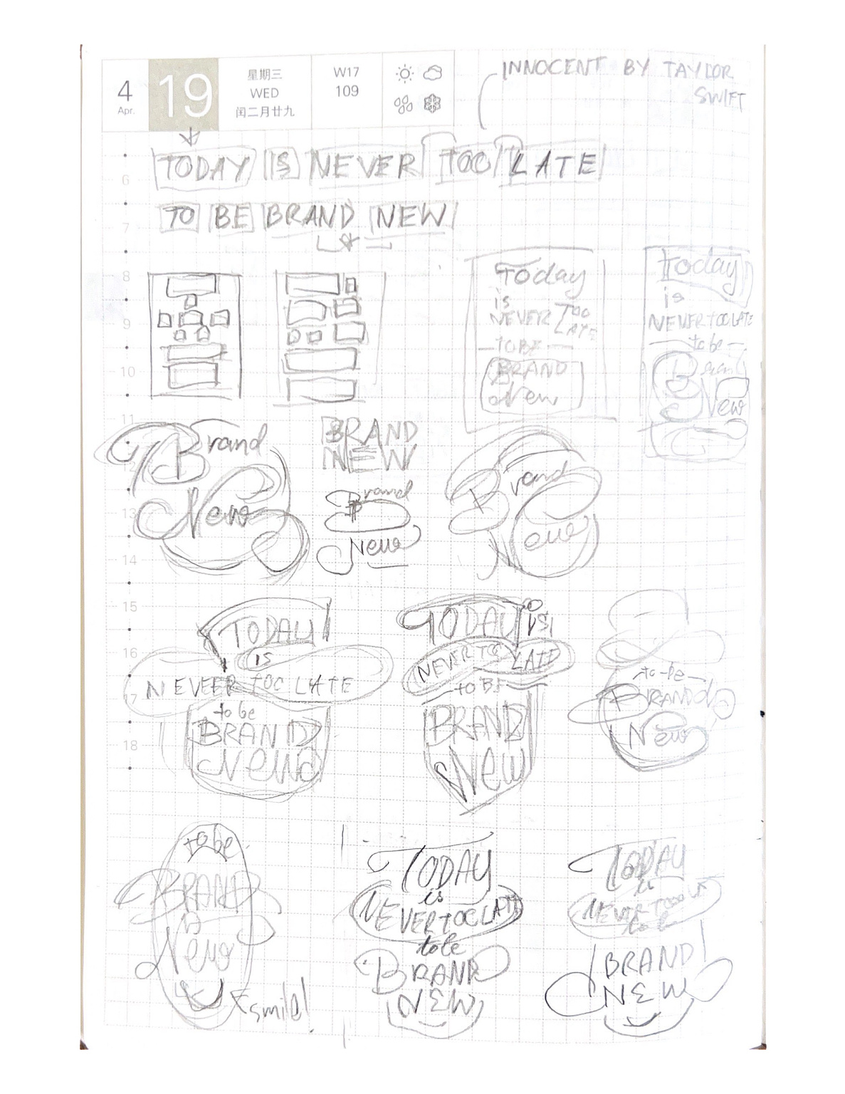
Day 1: It all began with a simple desire for a lettering wall poster in my room, inspired by the lyrics "Today is never too late to be brand new" from Taylor Swift's song 'Innocent'. This kick-started my lettering journey.
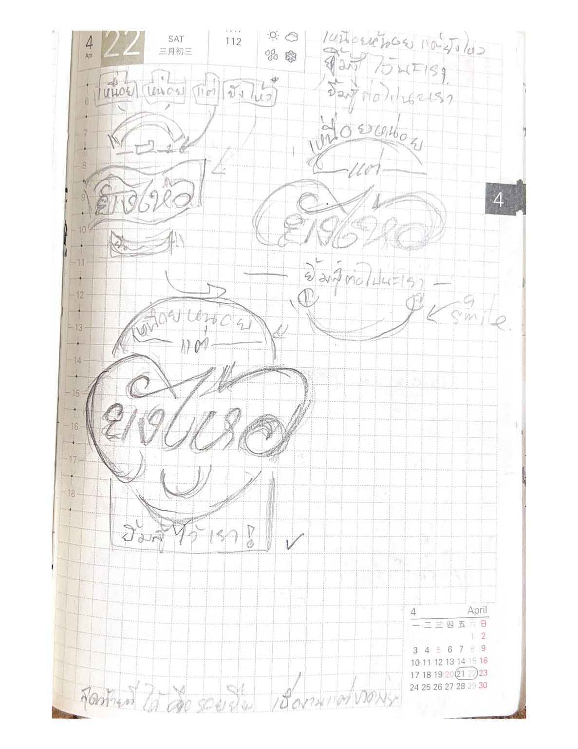
Day 4: I whipped up simple Thai lettering "เหนื่อยหน่อยแต่ยังไหว", which can roughly translate into "worn down but not worn out." I settled on the design pretty fast and already made a phone wallpaper version for it. The idea of shaping the letters into a heart is something I'd like to do more, because it looks awesome!
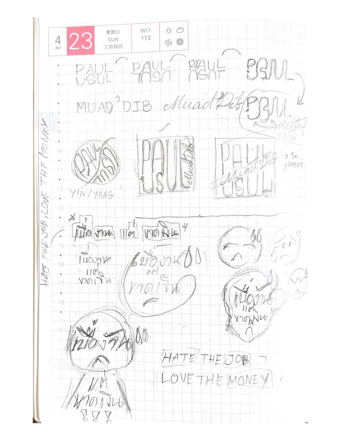
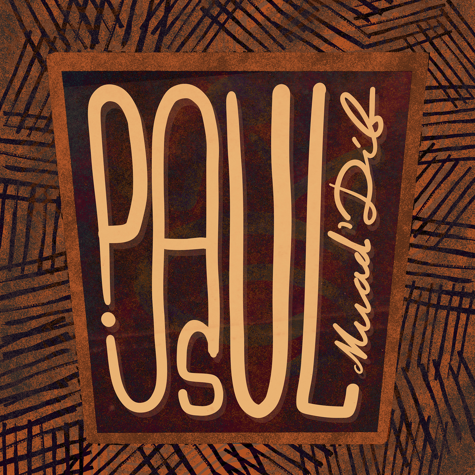
Day 5: I played around designing the name "Paul Atreides" from Dune. Since Paul and Usul, another name of Paul, is roughly the same letters, I thought it would be a nice twist to make them into one flow of letters. Another design sketch was Thai language lettering turned "เบื่องาน" into a emoticon of frustration. "เบื่องานแต่ขาดเงิน" can roughly translate into "My job is boring, but I need the money.", which I consider making the English version as "Hate the job, Love the money." in the future.
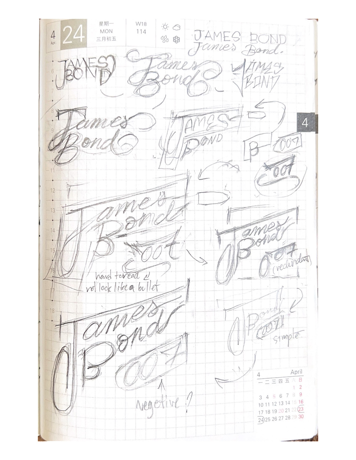
Day 6: I tried to design a lettering version of "James Bond" name. I experimented with various designs before coming up with the idea of morphing the name "James Bond" into a gun. I still haven't settled on the 007 part yet, because I got problems with balancing readability and creativity.
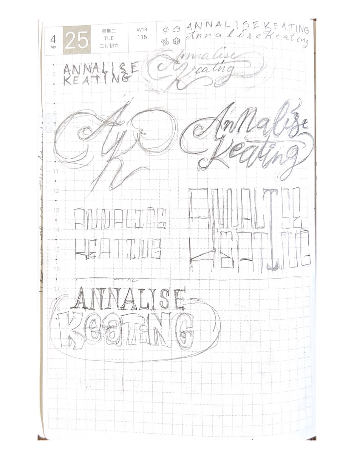
Day 7: I explored styles for Annalise Keating's name from "How to Get Away with Murder." I enjoy the show and particularly admire the character Annalise, despite her flaws, for her strength and independence. I think the modern calligraphy style looks best as those bouncing letters added more dynamic.
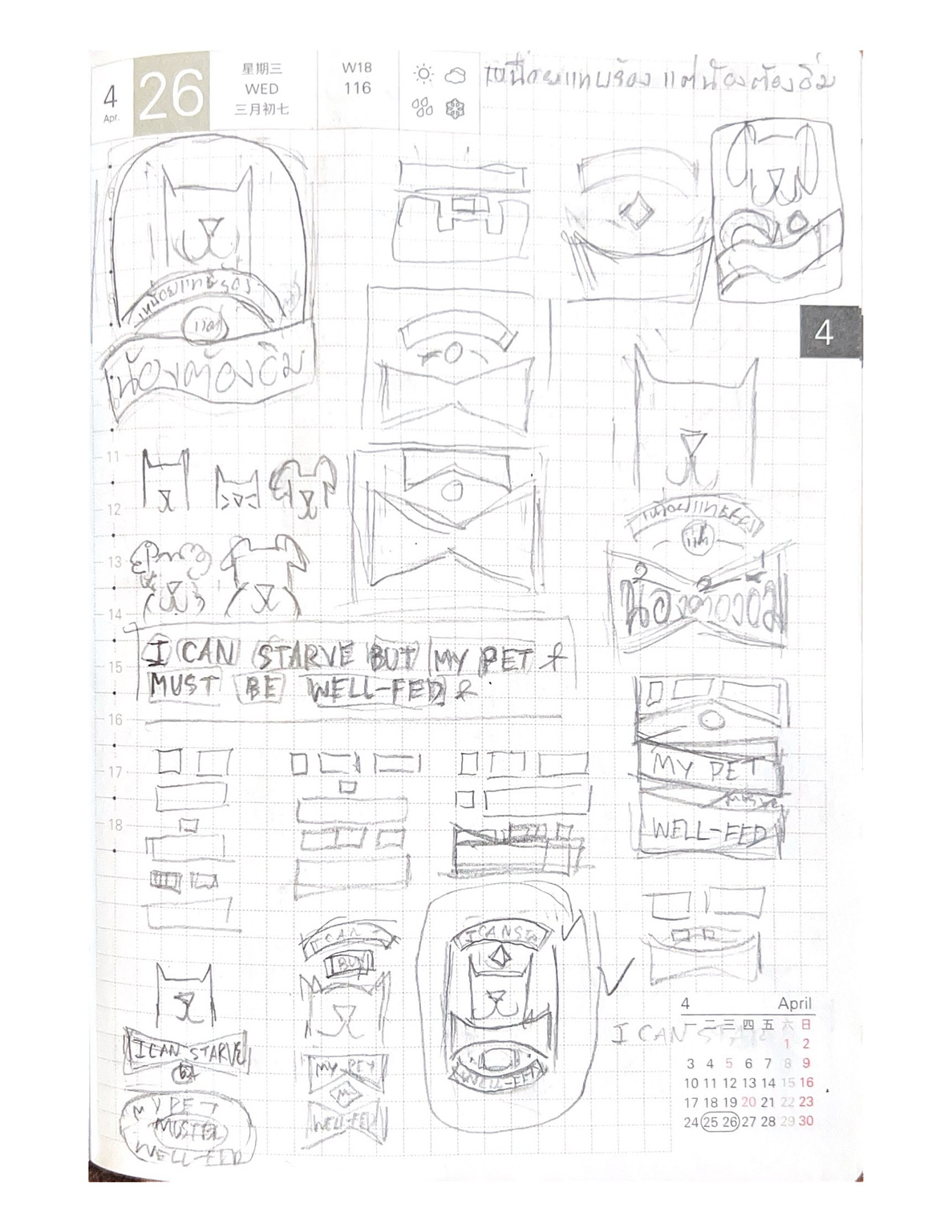
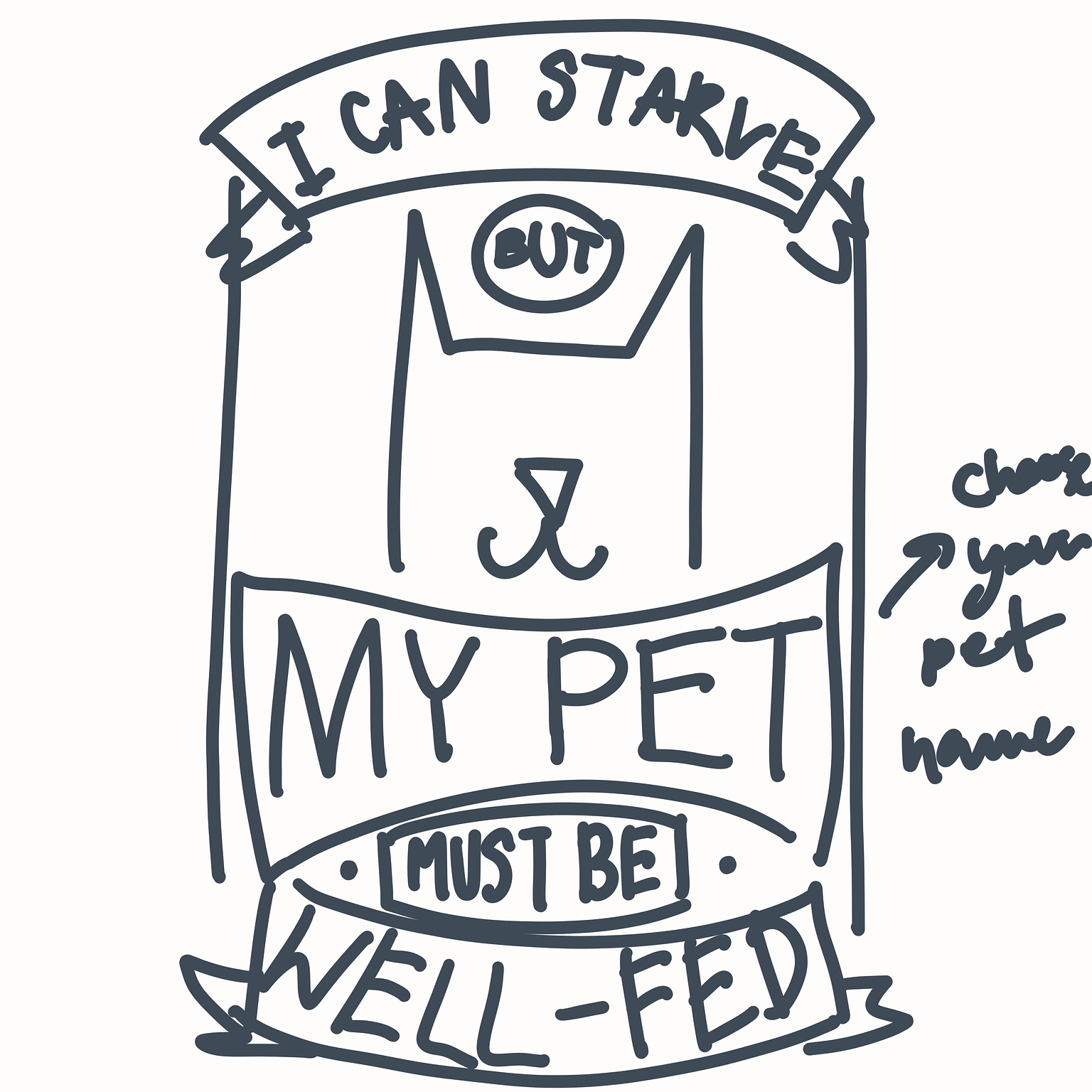
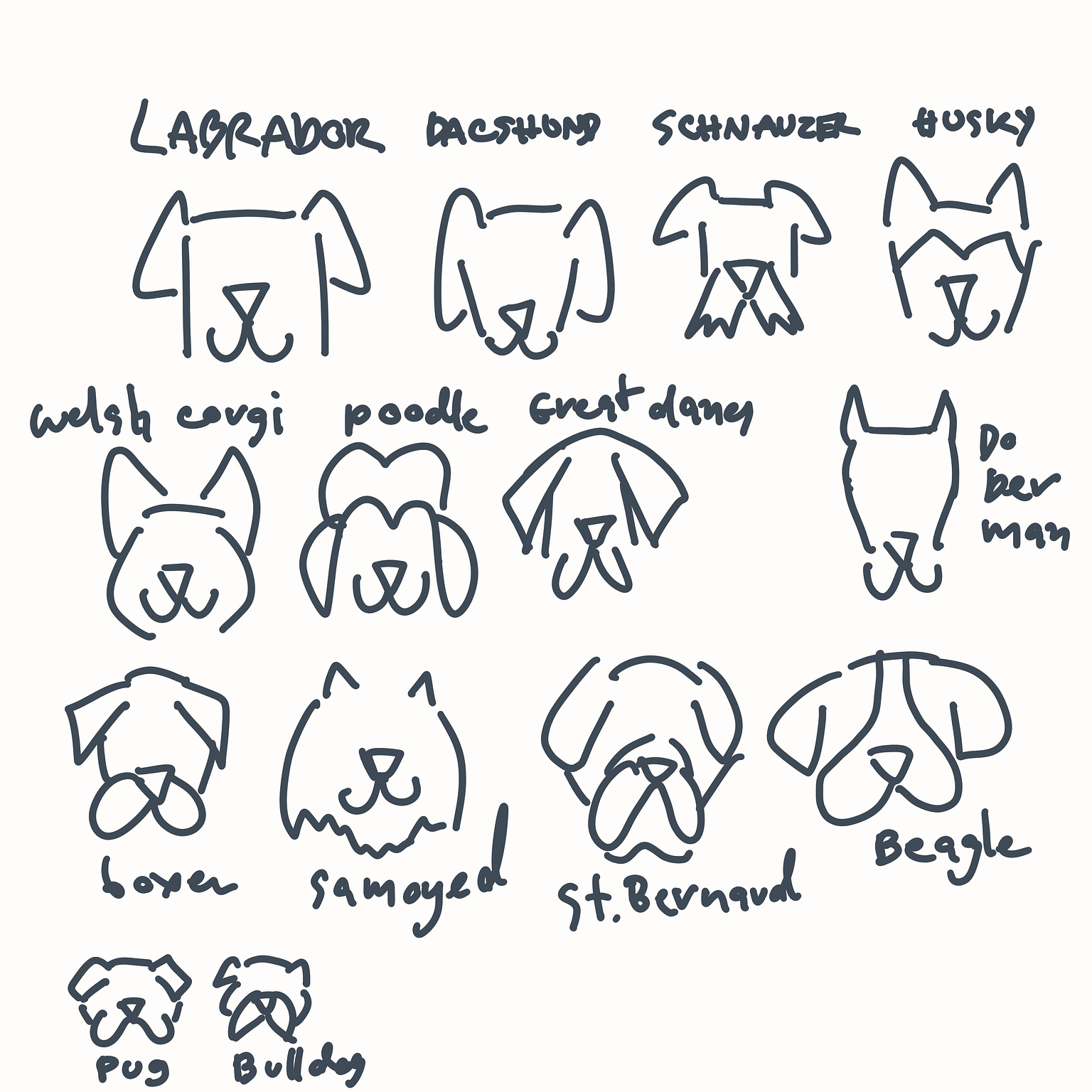
Day 8: I had an idea about making commission phone wallpapers tailored for pet lovers, using their pets' names and breeds for potential customization options. I worked on versions in both Thai and English, aiming to offer a personalized touch. The phrases go “เราท้องร้อง แต่น้องต้องอิ่ม” which can be translated into “I can starve, but my pet must be well-fed.” I haven’t finished the design yet, but I’ll get back to it once I learn more on lettering decorations.
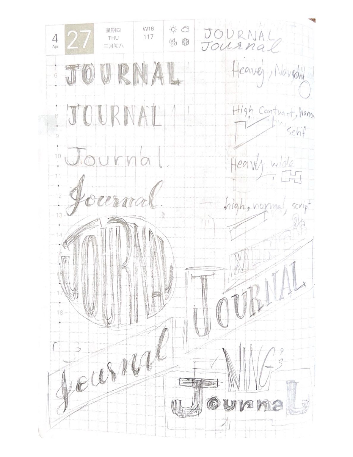
Day 9: I experimented with various letter styles, exploring high and low contrast to understand how they convey different personalities.
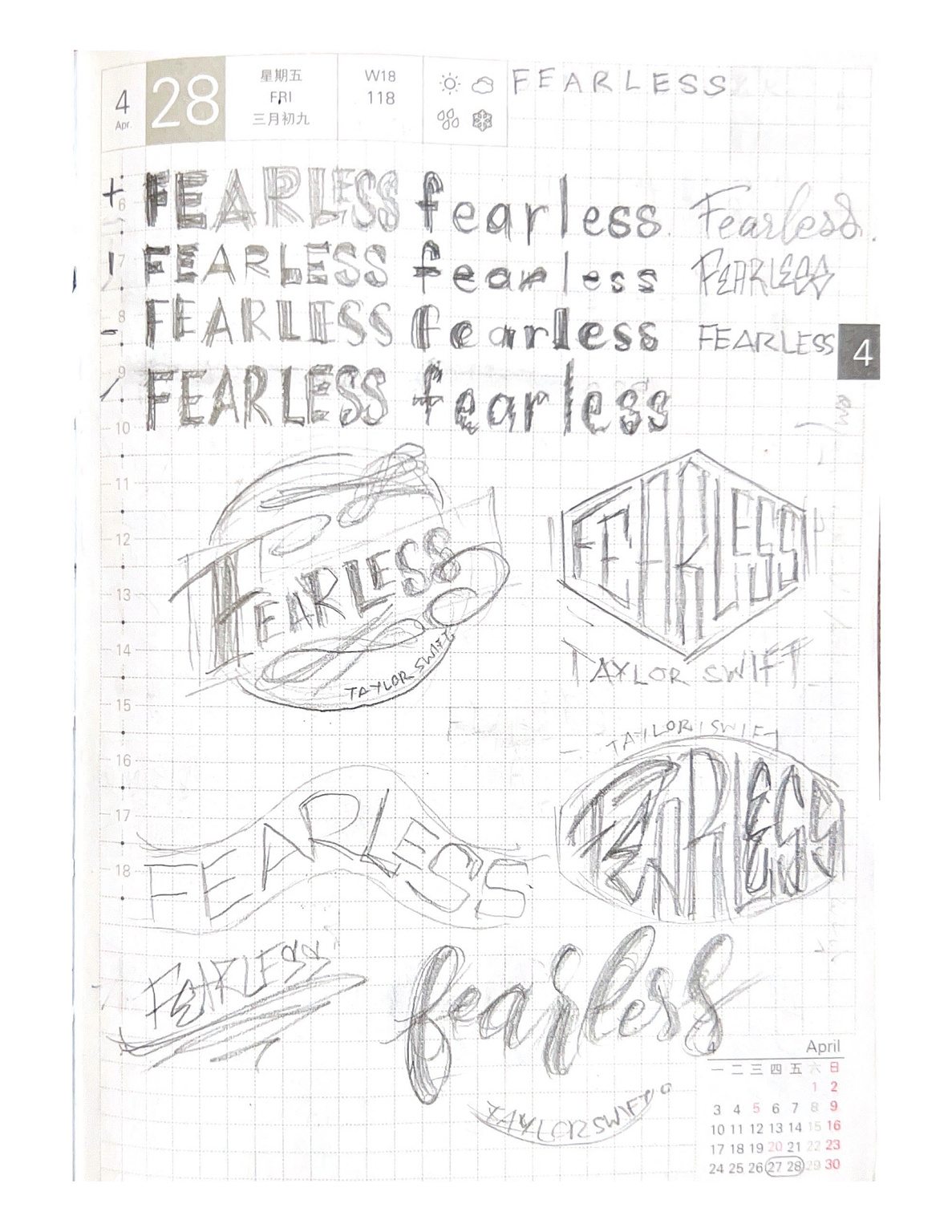
Day 10: I continued exploring contrasting styles within letters, using the song titled "Fearless" by Taylor Swift.
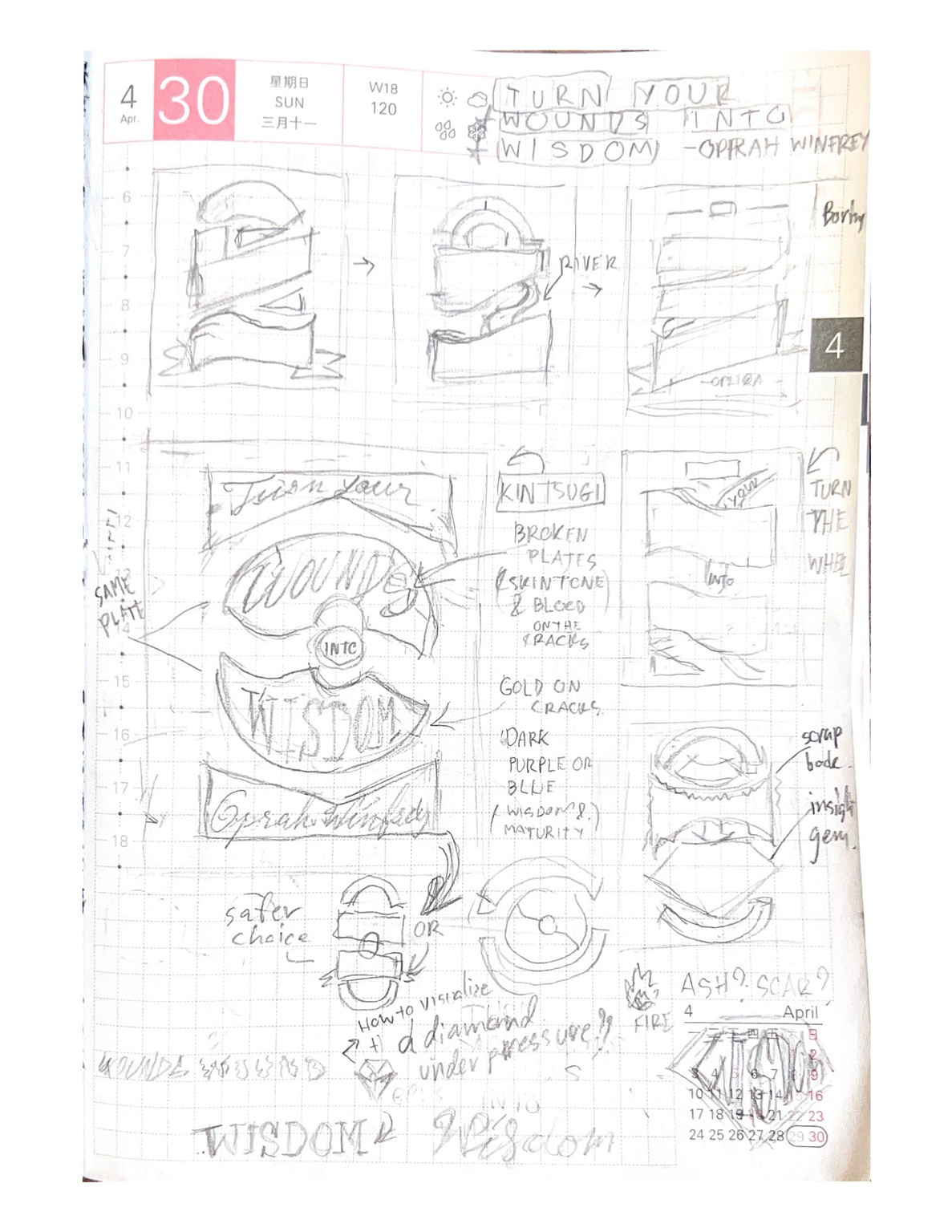
Day 11: I tackled the challenge of lettering my full name. Because I have a very long full name, I think it'd be a nice challenge. I don't want to broadcast my full name to the public that much, however, if I were to digitize one, I'd opt for the bottom one.
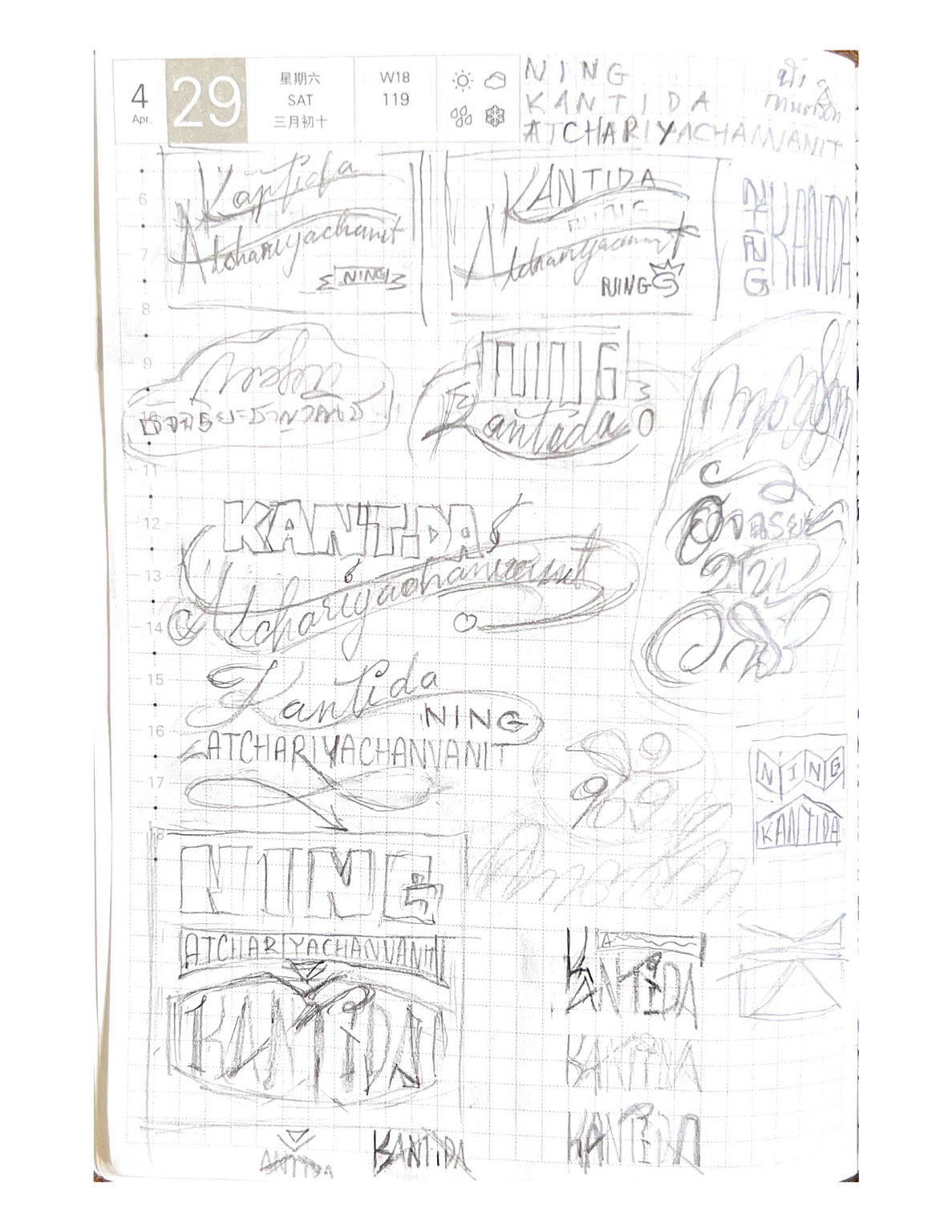
Day 12: On the final day, I worked on a design inspired by Oprah Winfrey's quote "Turn your wounds into wisdom." I focused on visually representing the transformation of wounds into wisdom, experimenting with metaphors like flowing rivers and transforming gems. I really liked the idea of carbon or ashes can become a diamond under pressure, but I got a problem on how to visualize the under pressure sentiment into the design, so I had to let go of that idea. My chosen design comes from the concept of "Kintsugi", a Japanese concept of repairing broken objects with gold to enhance their beauty. It symbolizes transformation and complements the quote well. I thought about a design featuring broken plates split in half, one side labeled "wounds" and the other "wisdom." It represents that life can be beautiful, not despite pain, but because of it. I really like this design concept and will someday turn into a lettering piece.
And that's a wrap on my first 12 days of lettering adventure. I look forward to the growth and evolution that the May Music Lettering Challenge I take on this month will bring in my lettering journey. Stay tuned for more designs and sketches ahead!
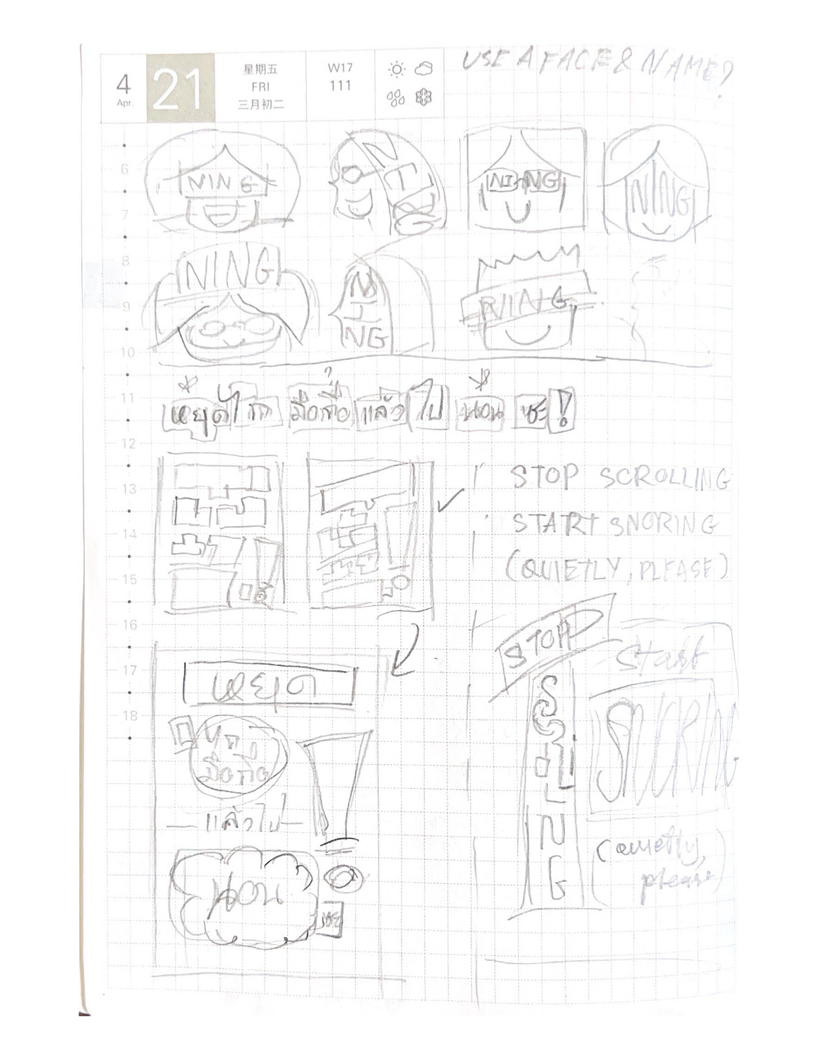
Day 3 : I explored the concept of combining a face and name for a profile picture–this didn't quite hit the mark yet. Also, I created a phone wallpaper design to curb excessive scrolling before sleep . I experimented with Thai and English versions and found the process so much fun. The Thai version-- "หยุดไถหน้าจอแล้วไปนอนซะ" already finished, the English version "Stop Scrolling and get some sleep" is still in progress.
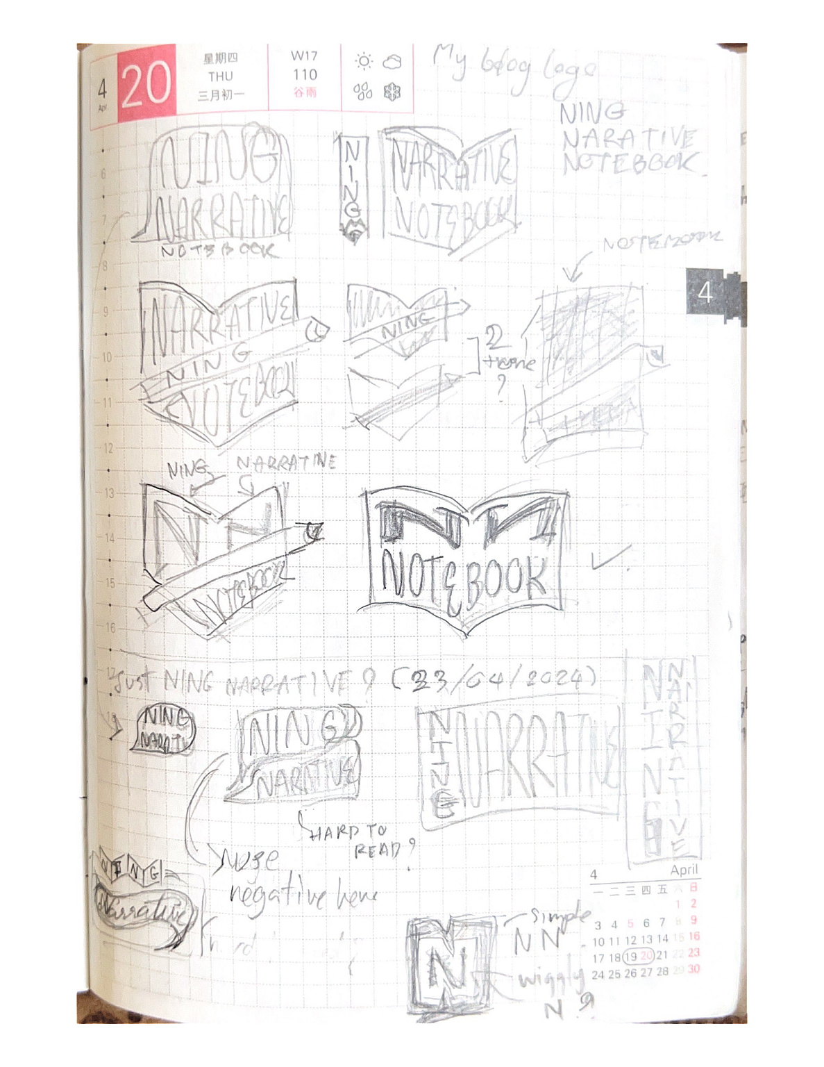
Day 2 : I worked on designing a logo for my blog "Ning Narrative Notebook ", experimenting with different designs and layouts. I love the idea of using the "N" as a corner of a page.

