
The Commission 00008-The Galileo Passport Case by Strathmere Leather
The Commissions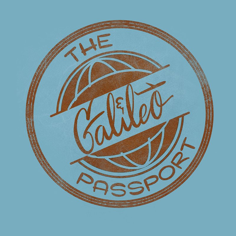
It’s incredible how quickly Aaron is launching new product lines for Strathmere Leather! Enter The Galileo—the premium passport case. What’s great about The Galileo is that it can hold not only a passport but also a pocket notebook and an international driving license, all in one case!
Conceptualizing
Now, back to our logo commission. Initially, Aaron provided direction for the design, referencing the classic looks of Trans World Airlines, Pan Am, and Frank Sinatra album covers.
However, the Jet Age style he mentioned involves bold typography and colors that evoke a sense of futurism, which I felt wouldn’t align with his brand identity or other logos. Therefore, I needed to reinterpret his preferences in a way that would be more suitable for his brand. From the references, I noticed a common theme of blue and aviation elements—something that could be incorporated into any design.
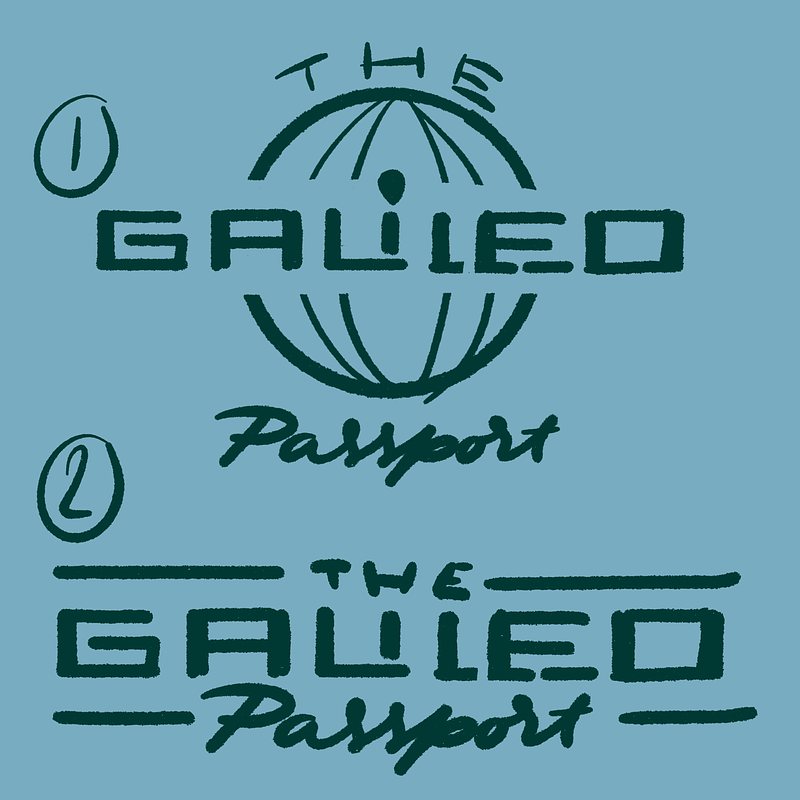
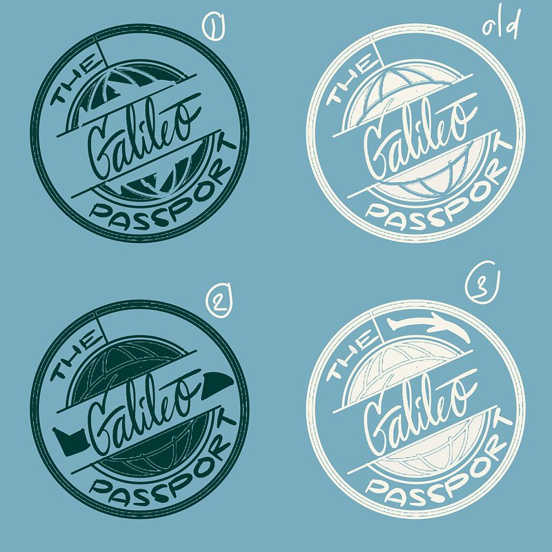
Next, I considered what kind of design would represent both Galileo himself and a passport case.
When I think of Galileo Galilei, I think of exploration and questioning assumptions. The image of a globe model tilted at exactly 23.5 degrees came to mind. This concept has been tested and doubted over centuries, ultimately becoming a proven fact that influences our understanding of the world. It represents something that has only been accepted after thousands of years of questioning reality, now allowing people to enjoy its benefits every day.
"Explore the world, discover new truths." This sentiment seems also fitting for a product like a passport case.
I decided to guide him toward a slightly different direction while still providing designs based on his initial vision.
He chose to go with my interpretation :)
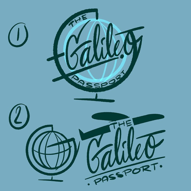
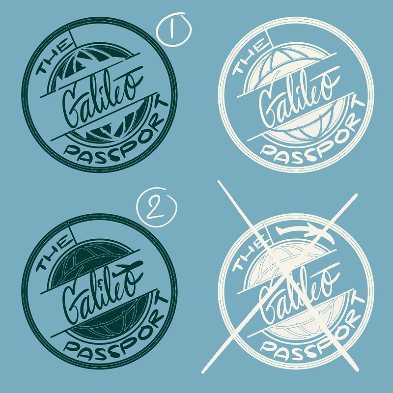
Afterward, I thought another approach for the logo could be to design it like a passport stamp.
Initially, I was doubtful about its legibility and how it would function as a logo, but sometimes you just have to try things out and test the assumptions—much like Galileo himself! :)
Luckily, I combined the globe with the passport stamp style, and it worked beautifully.
Finishing The Design
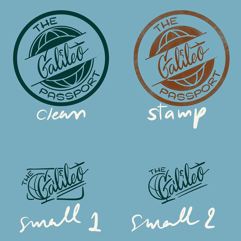
I sent the design to Aaron, and he requested the addition of an airplane to the logo since he and his first order of the passport case are both big aviation buffs, so giving a nod to the origin of The Galileo would be a little nice touch.
I happily obliged!
At first, I tried three different ways to incorporate an airplane
around the lettering. Then I realized that integrating it into the
lettering itself would be most effective. In fact, while
designing the lettering, I had already created a trajectory line ready
for takeoff but had forgotten about it (I promise I'm not
usually as forgetful as the writer of Game of Thrones! 😂).
He loved it! However, I instinctively wanted to create another
version for the design. I figured that the stamp-style logo
might be difficult to work with at a smaller scale, so I decided to make
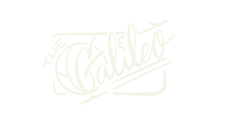
a logotype-only version for The Galileo.
I personally loved it! Of course, the globe is still present, but this design emphasizes the plane's flight direction even more. It literally flies across borders! What a wonderful design for a passport case—or at least that’s what I believe! Haha.
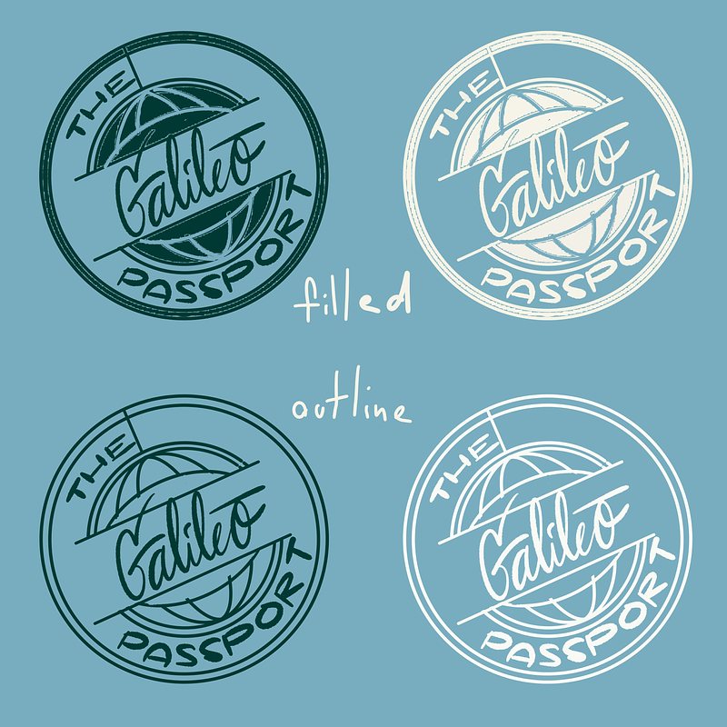
When I sent everything out and waited for him to choose which versions he wanted, he responded that he wanted them all!
I also refined the red stamp version to give it a grittier look so it would resemble a real passport stamp.
This project moved quickly; everything was sorted out in just five days from start to finish, just before he officially launched the product line.