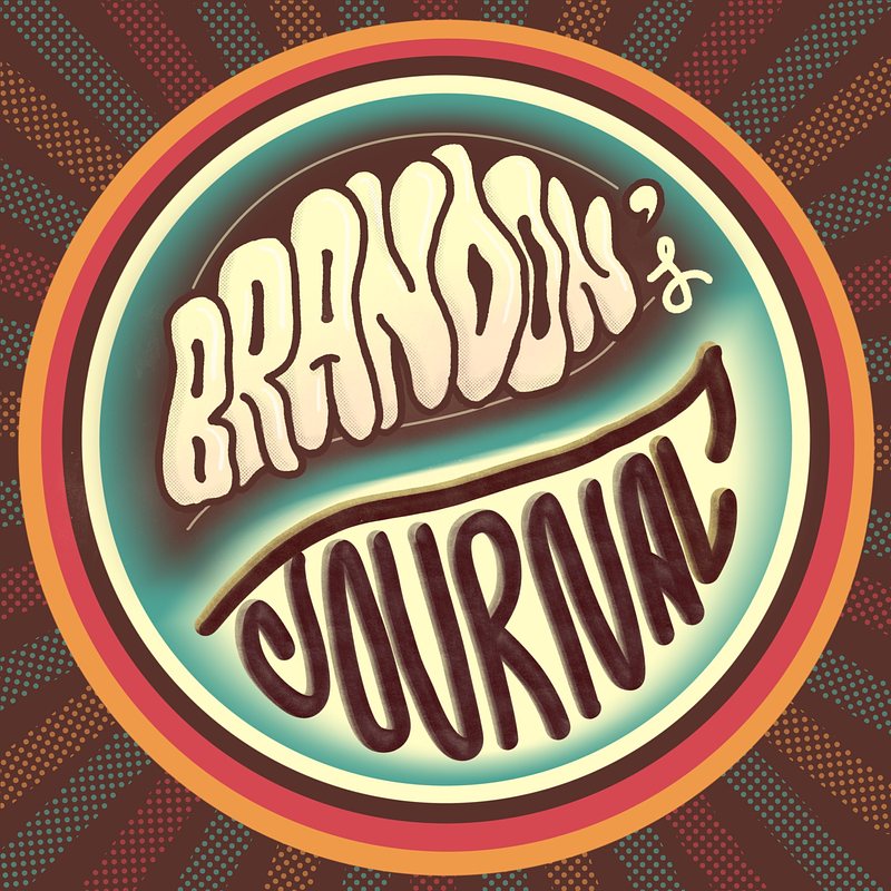
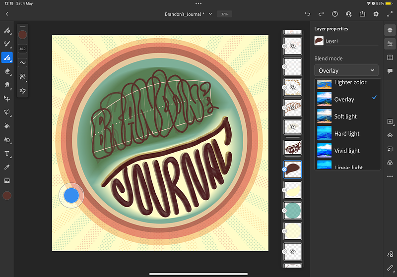
The Finished Project
The funky version of my design for Brandon's Journal.
I never thought my first commission would come this fast. Just
roughly two weeks into my lettering journey!
Well, technically, I did a lettering for an album cover years ago. But
that was for my close friend, so I don't think that counts. 😄
I had planned to build up my portfolio before taking on commissions, but
my first one came quicker than expected. A pleasantly surprised, indeed.
Brandon reached out to me
for a logo design for his blog, and I eagerly said yes without
hesitation. In fact, I'd been eyeing designing it because I'd been
following his blog and saw he changed his blog's name. A new name should
go with a new logo, right? 😉 You can also read about this
commission from Brandon's
blog! He wrote about various stuff that
you should definitely check out!
The Process
The Brief Brandon wanted a profile picture
for "Brandon's Journal" suitable for a circular shape on the Scribbles
blogging platform, a wonderful platform that I also use, btw.
He preferred a retro style with influences from the 80s and 90s
and wanted a minimalist design. But he ultimately gave
me creative freedom. He let me choose whatever styles and colors that
would look best. You can see that he let me take the wheel on
the design. Something I appreciate!
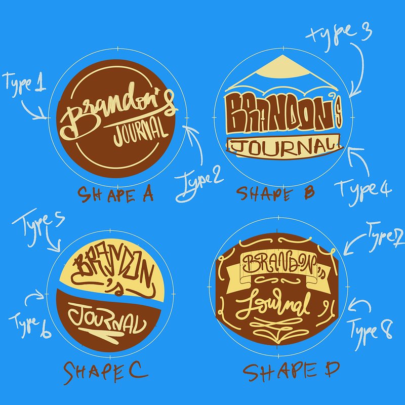
The Options After agreeing upon the commission, I
came up with a bunch of designs before choosing to offer four of them
that would look great as a circle.
The options I presented for him to choose from.
My initial thought was that the pencil shape looked the most
interesting. However, as a somewhat Buddhist, I always loved the
Yin-Yang concept. So I was surprised when he went with the
Yin-Yang shape (Shape C). Totally my jam.
For lettering styles, I suggested a graffiti style
(Type 3) for his name "Brandon" because each letter in his name is the
same size, so it would look great when stacked on top of each
other without compromising the legibility. Something hugely
important because the Scribbles' profile pictures are so tiny. This way,
we could fill the whole picture with letters.
He agreed with the recommendations, and I was off to work.
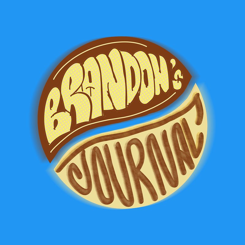
The Draft
The draft using the Yin Yang shape.
I created my first draft from the given feedback, using the Yin
Yang shape with the graffiti style for the name
"Brandon's,".
For the "Journal" lettering, since
“Brandon’s” part got a bold and colorful look, I opted for a more
calming vibe to emphasize the contrast, as the Yin Yang concept
itself.
The Color Choices He wanted me to try more
colors since I initially chose those colors because of his blog’s color.
However, I had changed the colors before his feedback came back! Because
I realized that his blog’s colors would only be visible for a few
elements, so it shouldn’t be noticeable. And I shouldn’t make the
decision based on it. So, I took the liberty and decided to go for a
retro vibe, something he mentioned in his first brief.
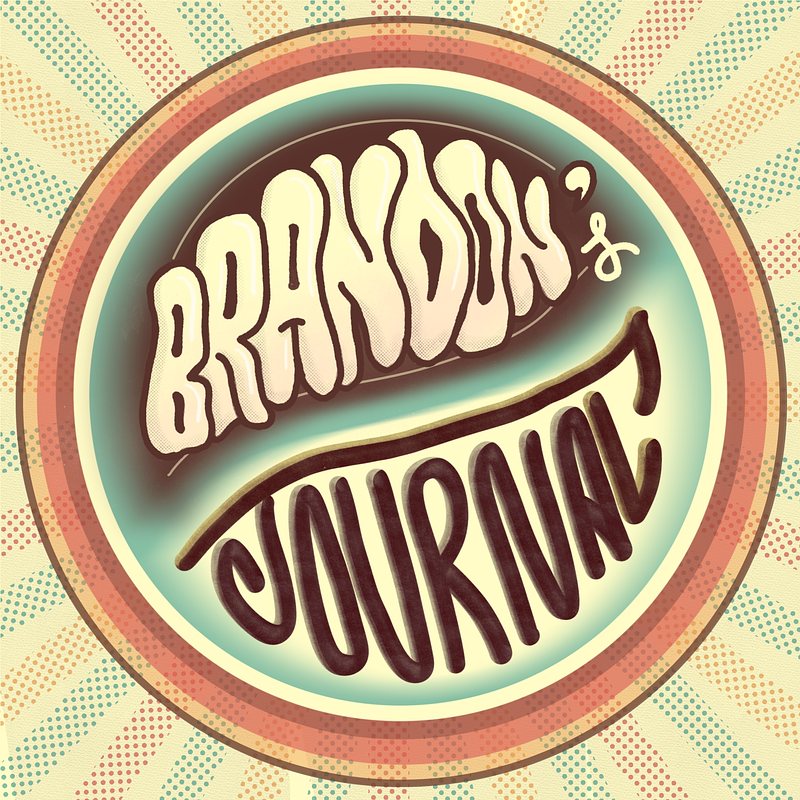
I searched for a retro color palette with as few colors as
possible that stood out well in small sizes. I initially went
with only 3 colors that would represent the retro vibe the most. While
also having high contrast to still resonate with the yin-yang theme.
Then, I thought we could make the background more pop, even though they
were not visible on his blog, due to the shape. Because he could use
this logo design anywhere else. So why not make it the best version for
everything? That’s why I decided to go wild and even made 2 versions of
it. The funky, and the pastel.
The pastel version of my design for Brandon's Journal.
Finalizing The Design He was beyond excited about
the design, so the only thing left was to finalize the design.
I was going to use Adobe Fresco for finalized final work, because I
wanted to do vector lines, and used the exclusive brushes there.
Unfortunately, the app just kept crashing, even to this day 😅 This
technical issue with Adobe Fresco forced me to switch to Procreate to
finalize the design.
My failed attempt to vectorize the design.
I decided to change the style a bit to go all in with the funky
look.
This process—just writing the
word “Brandon” took me hours to finish.
I had to draw multiple variations of each letter to ensure they
looked cohesive and readable when stacked. It was a challenge,
especially when creating a stacked letter with narrow characters, on top
of the fact that the final picture would get displayed only larger than
your thumb. Despite the challenges, I managed to create a
profile picture that turned out beautifully.
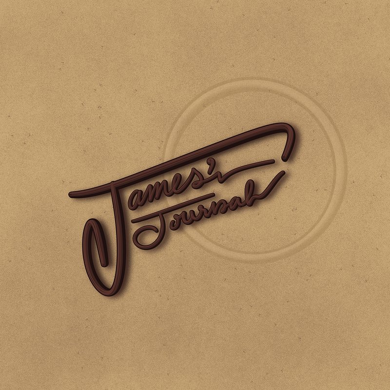
The Surprise I threw in a surprise
design as a thank you 'cause he was cool enough to double up on
the pay! It was something that hugely boosted my confidence as a new
designer. And I'd like to show my gratitude for that.
So, I sent him another design, something we talked about briefly in our
interactions. I turned my James Bond lettering design shaping the name
into a gun, I showed it to him before, but with the words "James'
Journal. instead.
Took me 20 minutes to get it done with half of that time going
into choosing the brush (lol). But it was the best decision
ever!!
Just look at how amazing it is!!
The Lessons Learned
Nail the letter alignments before coloring. This
lesson hit me the hardest! I forgot to duplicate the letter lines
before coloring. I had to retrace every letter all over again!! That
took way more time than the first one! Silly me 🙃 2.
Do the line work before decorating. I could have
finished it much earlier if I opted for Adobe Fresco first! I wish I
could have tightened up the “N” letter a bit. But the downside of
not using Adobe Fresco due to the app crashing is that I had to draw
every letter again if I were to realign one of them 😱 I will
contact the support team to solve this issue soon. 3.
The daily challenge I set for myself was demanding, leaving
little time for other activities. But I want to go all the
way and finish the month with 31 lettering designs!! In the future,
I plan to simplify the designs and better strategize designs
way ahead. The project, from the rough drafts to
finalizing details, spanned four days, with the actual design
process taking place in a day. , I encountered various obstacles and
lessons learned along the way. Despite the challenges, I am
proud of the outcome and the opportunity to showcase various styles.
I had a blast designing for my first commission. And
I'm so grateful for Brandon, who took a chance with someone
with little to no experience like me. He was so supportive
throughout the whole process. I would like to work together with him
again if an opportunity arises.🤞
I look forward to similar projects in the future, hopeful for more
commissions to come my way.
This first commission was just the
beginning, and I can't wait to see where my lettering journey takes me
next. I am so eager to apply the lessons learned and continue honing my
skills!