The Lyrics Lettering 00003-Angel With a Shotgun by The Cab
Music LetteringThe Work

The Inspiration
Angel with a Shotgun by The Cab holds a special place in my heart as one of my all-time favorite songs. Its infectious energy and emotion have always resonated with me on a deep level. The contrast between holding a shotgun and spreading the angel wings added a dramatic effect in the very best way. It symbolized the fierce determination and protective instinct one might feel for a loved one. You could easily imagine yourself in a battle for love not having a care about any other consequences by listening to the song. I've always wanted to do something creative inspired by this song, and today I finally decided to go for it.
“...I'm an angel with a shotgun
Fighting til' the wars won
I don't care if heaven won't take me back
I'll throw away my
faith, babe, just to keep you safe
Don't you know you're
everything I have?
And I, wanna live, not just survive,
tonight...”
The Process
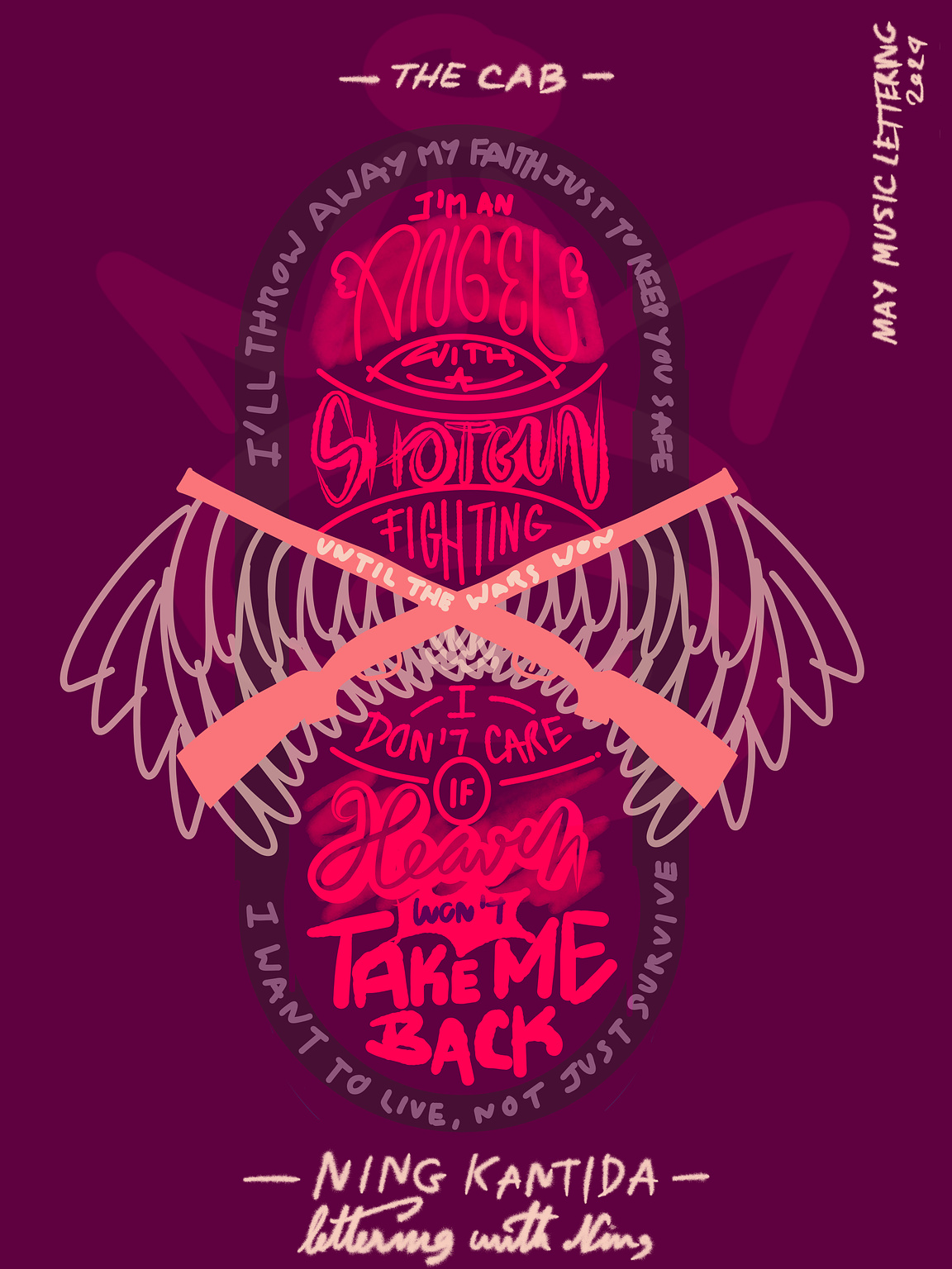
The idea of a shotgun with wings kept popping into my head, so I thought, why not make that the centerpiece of my design? I wanted to try a new layout style, something I've never done before, and it turned out to be pretty fun. It allowed me to fit more words in and tell a bigger story through the design.

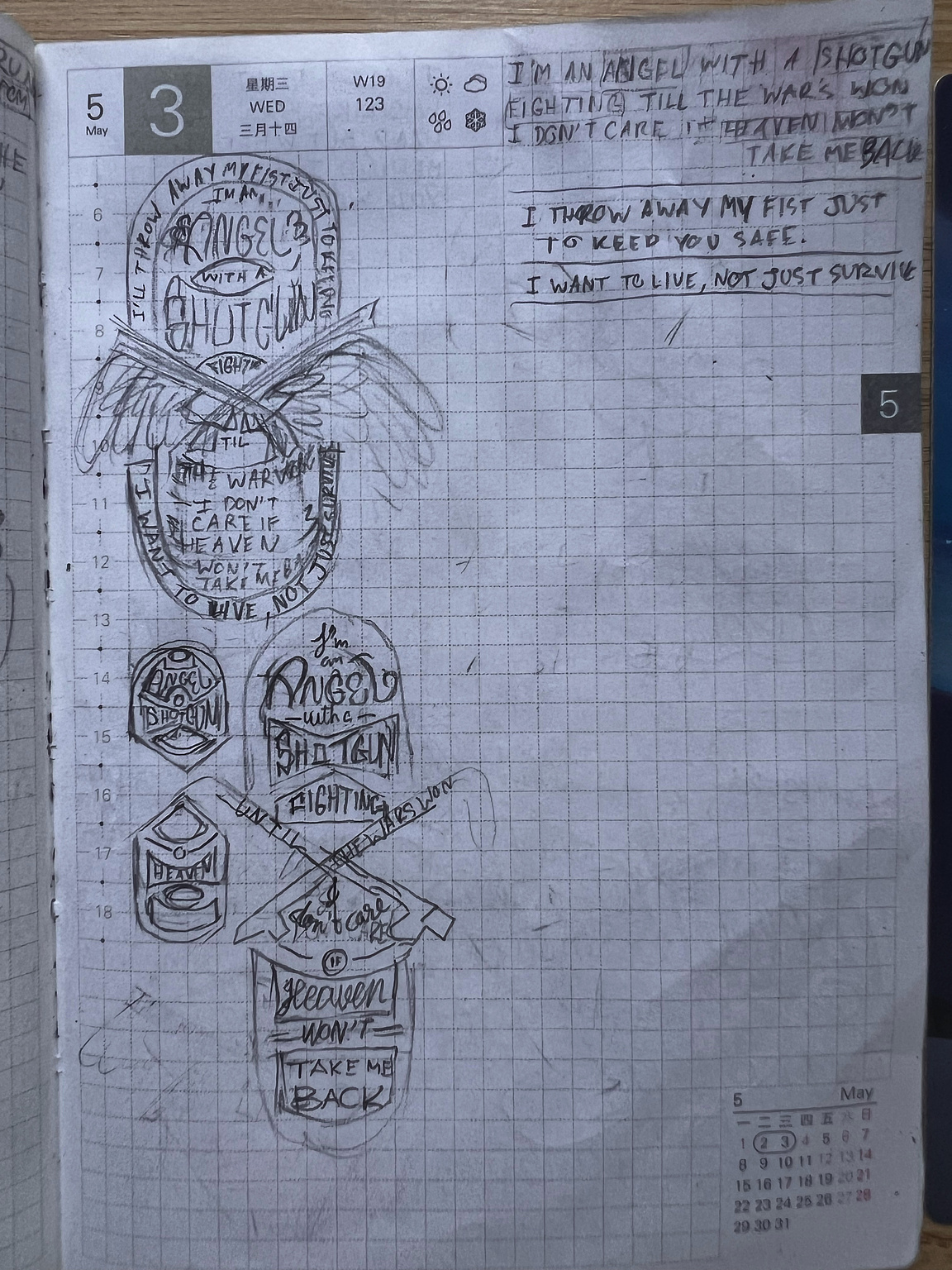
Trying to get the composition just right was a struggle. My initial sketch was tiny, and I couldn't cram all the words in there. So, I ditched the paper and turned to Adobe Fresco instead. I normally go with Procreate app, but I have no idea how to draw a clean straight object shape in there. And unfortunately, it turned out that I didn’t know how in Adobe Fresco either, lol. So, I just rolled with the overlapping lines and started scribbling the words.
Key words like "angel," "shotgun," "heaven," and "won't take me back" were given prominence in bold, large lettering, while the rest of the lyrics were arranged around an oval shape.
Wings were a bit tricky to draw since I'm not much of an artist, but for a first draft, they turned out alright.
I added some colors, which are somewhat unreadable, but I had no energy
left to recolor everything anymore, lol.
This design is definitely something I want to come back to and finish one day. The lettering styles need some serious work, so for now, they're just placeholders. Getting the composition nailed down was tough, but I'm determined to revisit this piece and give it the polish it deserves.
Edited on 2024/05/04: I posted the wrong image for the final version, lol.
