
Logo Concept 03-TripleWP Logo
The Logo Concepts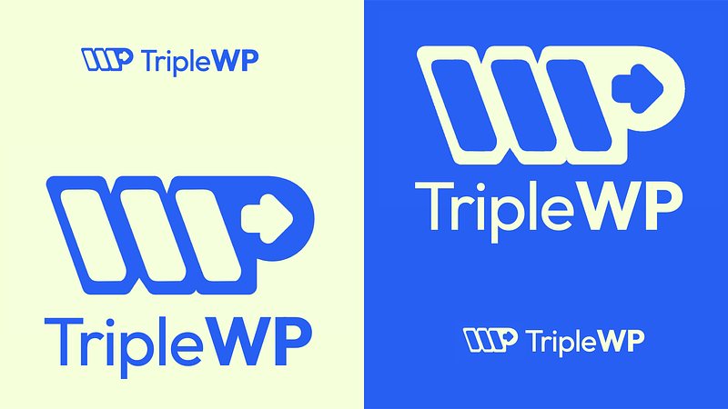
Logo Concept Series
I decided to expand my skills in icon mark and typography to broaden my design range, especially for logo design. While exploring this journey, I came across a daily logo challenge from Logo Core and decided to take it on. So, I will showcase the results of my logo practice based on the provided briefs.
Think of this post as a presentation of the initial concept to an imaginary client. It's my way of discussing my thought process and my design choices before exchanging feedback and revisions.
Please keep in mind that creating a polished logo design typically requires more than just a few days. Therefore, consider everything from this challenge as a rough draft that will need further feedback from clients for refinement to truly shine.
While these designs may not be fully refined, I believe they will offer us a general idea of the concept.
That being said, let's kick things off with the brief from the challenge:
The Brief from LogoCore
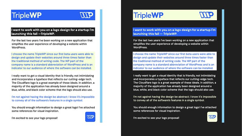
Hey, Henry!
I want to work with you on a logo design for a startup I'm launching this fall—TripleWP.
For the last two years I've been working on a new application that simplifies the user experience of developing a website within WordPress.
I choose the name TripleWP since our first beta users were able to design and update their websites around three times faster than the traditional method of writing code. The WP part of the company name is a standard abbreviation of WordPress and is an indicator to our audience of where the software can be installed.
I really want to get a visual identity that is friendly, not intimidating and incorporates a typeface that reflects our cutting-edge tech. The Cloudflare logo is a great example of these ideals. In addition, a majority of the application has already been designed around a blue, white, and black color scheme that the logo should also use.
I'm not against having the design be abstract; I know it's impossible to convey all of the software's features in a single symbol.
You should have enough information to design a great logo! I've attached some references for visual inspiration.
I'm excited to see your logo proposal!
Jim Halpert,
TripleWP
Brief Interpretation
Currently, trends in visual identities for tech companies diverge in two directions. You either choose black and white to enhance trustworthiness and reliability, or opt for vibrant colors to convey innovation and energy, reflecting cutting-edge qualities and technologies while being friendly.
Based on the brief, the brand personalities and identity clearly lean towards being friendly and slightly cutting-edge, rather than corporate. Therefore, we should choose vibrant colors and geometric typefaces with a sense of openness, reflecting a user-friendly and approachable vibe.
In the brief, they mentioned they are open to using abstract design, but I would avoid overly abstract elements, as they require significant interpretation from the audience to understand the logo. I aim for simplicity—something visually appealing that isn't overthought.
What’s a bit challenging is how the client wanted to keep using black and white in their color scheme. So the logo needs a balancing act: friendly and approachable styles combined with cutting-edge technology while incorporating a black and white color scheme. It will be a bit challenging to synergize all of this into a cohesive visual identity, but I like the challenge.
Typography
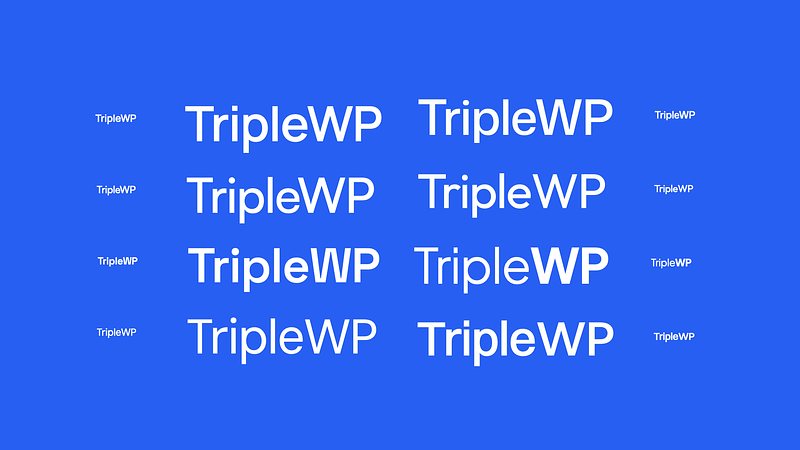
The first step for this project is selecting the typeface, because the wordmark will be used most of the time, and will have a huge impact on the overall look and feel for the brand.
I've experimented with various geometric typefaces and popular fonts in the tech and UI design space. They tend to look similar at first glance, but for the 'TripleWP' wordmark, one thing I'm particularly looking for is how each letter works together. The challenge lies in the letters “r” and “i.” They can easily blend together and appear as the same shape in small size, so I aim for clear separation for legibility in my font choice, allowing for easy use in articles and websites.
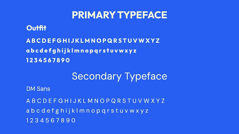
Eventually, I chose the Outfit font for its welcoming yet slightly techy geometric style that feels slightly unique.
Understanding that Outfit isn't suitable for body text, I suggested DM Sans for the website, reserving Outfit for headings and digital assets. If the client finds a single typeface style too plain, I’d recommend adding Space Grotesk for its character and personality, although simplicity remains a priority.
Color Scheme
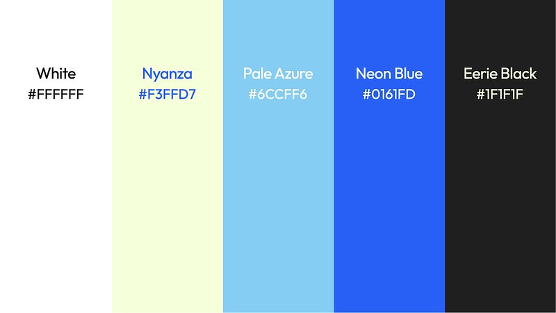
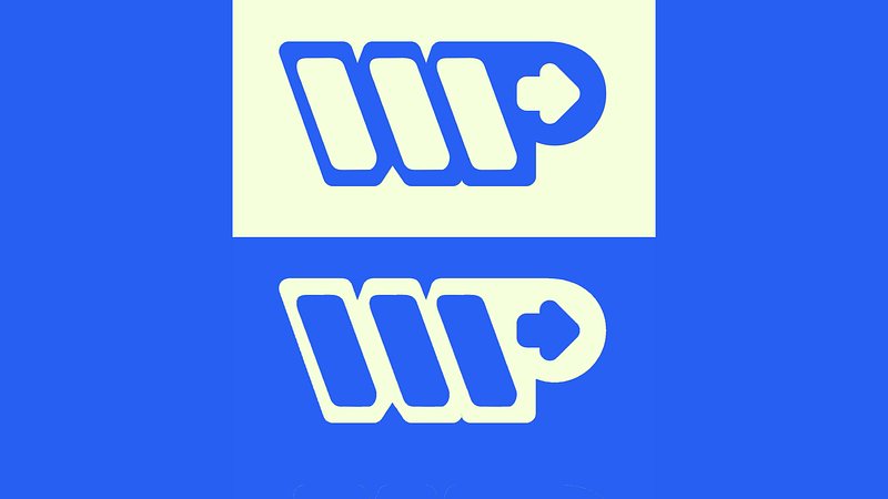
The client's specifically request for black and white in the color scheme limits creative freedom a little bit. To infuse some energy to the brand, I chose neon blue and a very light green-yellow instead of pure white for the logo. This color appears white against neon blue but offers vibrancy as a background color. I think this approach strikes a good balance, because we can still have white and black, while also giving the brand some innovative energy.
Logomark
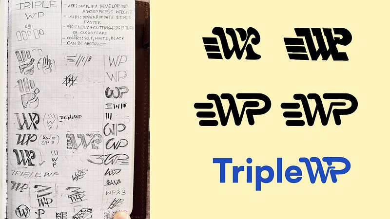
Next, regarding the logo mark itself: I sketched various styles of the letters “WP” and even tried to digitize some of these ideas. However, I then realized that the 'triple' aspect wasn't translating well into the icon. If I were to use any of these designs, it might be mistaken with Wordpress itself, and the audience would not have associate with the brand name TripleWP as much. We need the icon that represent TripleWP as a whole identity, and not just a part of them.
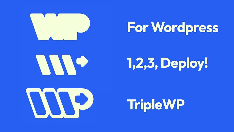
Naturally, I decided to refocus on visualizing the 'triple' concept in a way that conveys speed and simplicity, as emphasized in the brief. The notion of being "three times faster" isn't a sustainable identity as it can evolve. Instead, I concentrated on the values of “fast, simple, and friendly”, which should be the core brand identity.
Conceptualizing these, I envisioned something as effortless as snapping fingers: like counting with '1, 2, 3', leading directly to an updated website. This approach effectively encapsulates and markets TripleWP's brand value.
I concentrated on simplifying and visualizing the concept to a downloading status or step sequence—visually representing the process with an arrow cursor. I placed "WP" as an outline around this icon, and it turned out visually pleasing, simple enough to convey the idea of tripleWP.
Final Words
This project serves as a reminder that even when a client requests only a logo, we must consider the overall visual identity and sometimes assist in crafting the brand identity.
In this case, I even developed the brand message for TripleWP.
A potential brand tagline could be: "1, 2, 3, Deploy!"—simple, fast, and so user-friendly, that you’d feel like you could just count and publish your website!
After I got an approval from the client along with their feedback, I would definitely experiment further with the color scheme to enhance UI compatibility for application usage, adjust the line weight of the WP outline in the icon, and possibly round the corners of the wordmark.